Watercolour Paper: What the Surface Changes
Watercolour paper changes edges, washes, and brush marks; compare textured and smooth surfaces to choose one that suits the results you want to explore.
The common mistake with watercolour paper is choosing by appearance alone: a visibly rough sheet can seem “more watercolour,” while a smooth one looks easier to control. That shortcut can cost you the marks you meant to make, because the surface changes how pigment settles, how edges form, and how a brush travels. Watercolour paper is not simply a support; its texture helps shape the character of the painting.
For a useful choice, start with the result you want to explore. Textured paper can make broken, lively marks easier to see, while smoother paper can give fine lines and small shapes a cleaner stage. Neither surface is universally better. The right one depends on what you want the water and pigment to do.
Choose by the mark
Paper texture matters because a brush does not meet a perfectly even plane. On textured paper, the raised areas and shallow hollows interrupt contact. A lightly loaded brush may touch some parts of the sheet and skip others, leaving a broken mark. On smoother paper, the bristles meet a more even surface, so a controlled stroke can look continuous and precise.
That difference shows up in washes, too. A wash is a spread of diluted pigment, and its appearance depends on both the surface and how wet the brush and paper are. Texture may leave small variations where pigment gathers or the brush misses a hollow. A smoother surface can make a wash appear more even, though it still takes careful handling to keep its edges and tone consistent.
- For lively, broken strokes: try textured paper, especially if you want dry-brush marks to remain visible.
- For fine detail: consider smoother paper, where narrow strokes and small shapes can read clearly.
- For soft washes: compare both surfaces with the same pigment and brush; texture can add variation, while a smoother sheet may show a more uniform spread.
- For a mix of loose and precise marks: choose the surface that supports the marks you want to dominate, then adapt the other marks to it.
These are tendencies, not promises. Pigment, water, brush shape, and timing all affect what you see. The paper simply changes the conditions under which those choices become visible.
Match texture to intent
Textured watercolour paper suits work that welcomes an irregular surface. Think of dry grasses, weathered stone, foliage, or a loose study of changing light. The texture can help a brush leave varied marks without requiring every shape to be described with a careful outline. It can also make a broad area feel less mechanically flat.
That same texture can complicate work built around small, crisp details. A fine line may break where the brush crosses a raised or recessed part of the sheet, and a tiny shape can compete with the paper’s own visible pattern. If that interruption is distracting, smoother paper is often a more comfortable place to work.
Smoother paper can suit lettering, delicate contours, small botanical studies, and paintings that depend on clear edges. It gives a fine brush a more consistent path and can make small changes in shape easier to see. Its quiet surface may also help a dense arrangement feel orderly.
There is a trade-off: an even surface can make a painting look very controlled if every mark is equally tidy. If you want a softer, less uniform quality, you may need to vary the brush pressure, water, or edge rather than relying on texture to introduce variation. The surface does not decide the style for you; it makes some choices more visible than others.
Compare paper types
Watercolour paper is commonly described as rough, cold-pressed, or hot-pressed. These labels refer to surface character, but the exact feel can vary by maker. Rough paper has a pronounced texture. Cold-pressed paper is usually textured but less strongly so, making it a middle ground for varied marks and readable detail. Hot-pressed paper is generally smoother and often appeals to artists who want a clean surface for fine work.
Those names are helpful starting points, not a strict ranking from beginner to expert. A rough sheet is not automatically more forgiving, and a smooth sheet is not automatically easier. A painter who likes scattered, broken marks may find rough paper intuitive; someone who wants a delicate line may feel more at home on hot-pressed paper.
Also separate surface from other paper qualities. Weight, sizing, fiber, and how the sheet is supplied can affect its handling, but they are not the same thing as texture. If a particular paper’s suitability for your process depends on its label or manufacturer instructions, check those details before buying or using it.
Try a focused comparison
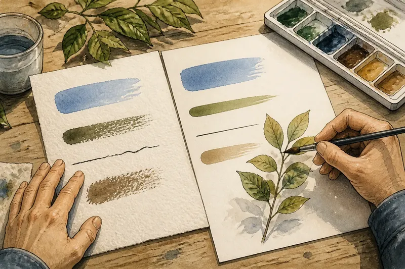
A small comparison can reveal more than a stack of guesses. Use two scraps or sample sheets, one textured and one smooth, and make the same few marks on each: a diluted wash, a firm stroke, a fine line, and a dry-brush pass. Keep your brush and pigment consistent, and notice where the results differ. You are not looking for a winner so much as a surface that makes the marks you value easier to see.
Say you want to paint a small arrangement of leaves with a few crisp veins and loose, broken shadows. You could try the same leaf shape on cold-pressed and hot-pressed samples. If the veins feel interrupted on the textured sheet, the smoother one may fit the drawing; if the shadows look too uniform there, you might keep the smooth sheet but vary the brushwork, or choose a middle texture that supports both aims.
For a useful comparison, look at:
- Stroke continuity: does a light brush pass stay whole, or break across the surface?
- Edge character: do wash edges look crisp, softened, or irregular?
- Fine-line clarity: can you see a narrow line cleanly at the scale you plan to paint?
- Pigment variation: does a flat mark show the amount of texture or unevenness you want?
- Your response: does the surface invite the kind of brush movement you enjoy, or make you keep correcting it?
Let samples dry before judging the final appearance. Wet pigment can look darker and more reflective than it does after drying, and an initially subtle surface difference may become clearer as the sheet settles. A quick note beside each sample—paper type, pigment, and brush—can help you remember what you were comparing.
Which surface fits your aim?
Is rough paper right for loose painting?
It can be a strong fit if you want visible grain, broken strokes, and irregular variation to contribute to the image. If you need every small contour to stay crisp, its pronounced texture may feel intrusive instead.
Is hot-pressed paper best for detail?
Its smoother surface can make fine lines, lettering, and small shapes easier to read. It does not make detailed work effortless, but it removes some of the interruptions a more textured sheet can introduce.
What if I want both texture and detail?
Cold-pressed paper is a reasonable place to begin because it often sits between rough and hot-pressed surfaces. Try it with your own brushwork: the balance that feels useful depends on how much texture you want showing through the quieter parts of the painting.
Should beginners choose smoother paper?
There is no single beginner surface. Choose based on the marks you want to practice: a smoother sheet may suit controlled lines, while textured paper may suit loose strokes and broken washes. Sample sheets can help you decide without committing to a full pad.
Let the surface contribute
A useful watercolour paper choice begins with a plain question: should the sheet show itself, or stay quiet behind the marks? If you want grain and variation to become part of the image, textured paper is worth exploring. If your subject depends on fine edges and small, legible shapes, a smoother surface may serve it better.
As you compare watercolour paper, keep one small sample from each surface beside your work area. Add the marks you often use, then consult those samples when a new painting calls for a different balance. The paper’s texture can be a deliberate part of your visual vocabulary, not a surprise you discover halfway through a wash.